Text
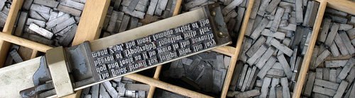
It’s been a long time since Johannes Gutenberg revolutionized the printing process by developing movable type printing. I’m guessing most people haven’t even seen a printing press in real life—I definitely haven’t. Typesetting back in those days is completely different from what it is now. Typesetters had to physically place movable type into letter cases. Things have changed…well, for most people.
Attribution: Willi Heidelbach
Aardvark Letterpress in Los Angeles is different. It’s a company that still does typesetting the “old” way. I stumbled upon this short film recently, and I think tells an interesting story about this dying industry. I also thought that the filmography was great.
Curly quotes
One of the most annoying things to find in a document, especially if it is using a serif font, is the lack of “curly quotes.” There’s a reason why straight quotes were made in the first place. Remember typewriters? When they were still made, manufacturers decided to use straight quotes (“) in order to save space and limit the number of characters. It’s a fair decision. The use of straight quotes today, however, is not justified. We’re done with typewriters. Straight quotes are not typographically correct! If you can, use the “curly quotes.” They look much better.
Ligatures
This definition may not be entirely accurate, but it gets the point across: a ligature is essentially a combination of two or more individual characters.

It’s incredibly annoying to find characters colliding with each other in documents. I never noticed this issue before, but ever since I found out about it, I can’t stop finding it. Back when movable type was still used, characters never collided. It’s just physically impossible. Ligatures were often used to solve the spacing issue.

Attribution: Daniel Ullrich
If characters didn’t collide then, why are they colliding now? I don’t understand why typography these days looks worse even though our technology is far superior. Are people really that lazy? It’s even worse when people actually use Times New Roman! Most versions don’t have ligatures! It looks horrible, especially when people sell books using it!
To summarize this section, here is some advice. Use ligatures. Use curly quotes. Don’t use Times New Roman. If you want an alternative, I highly suggest Linux Libertine.
Why Chrome Sucks
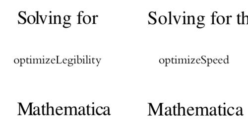
Chrome is my favorite browser. There’s nothing better. It’s awesome, but it also sucks. Here’s why. Chrome has this neat little feature. It’s a CSS rule that is supposed to make everything look amazing. You just add text-rendering: optimizeLegibility to some element and it automatically adds ligatures and improves the kerning! The sad truth is that it murders the kerning, making your text look horrible.
LaTeX!
Some of you may say, “Just use LaTeX! It’s awesome!” Yeah, LaTeX is awesome. I just don’t want to use it. HTML/CSS is ubiquitous. Almost every device has a web browser, and you don’t need to install a bunch of software to work with it. After years of having the web, aren’t we ready to use it for serious typesetting? My answer to that question is, yes—as soon as Chrome gets its act together.
Open Web Documents
A friend and I had an idea. The idea was to bring typesetting to the web. What we created was Open Web Documents. Unfortunately, we haven’t made too much progress. While the idea is great, the technology just isn’t ready for it. Also, pagination sucks.

Hi 👋. I’m a software engineer in the San Francisco Bay Area, and co-founder of FunnelStory.