Plotting metrics as rates
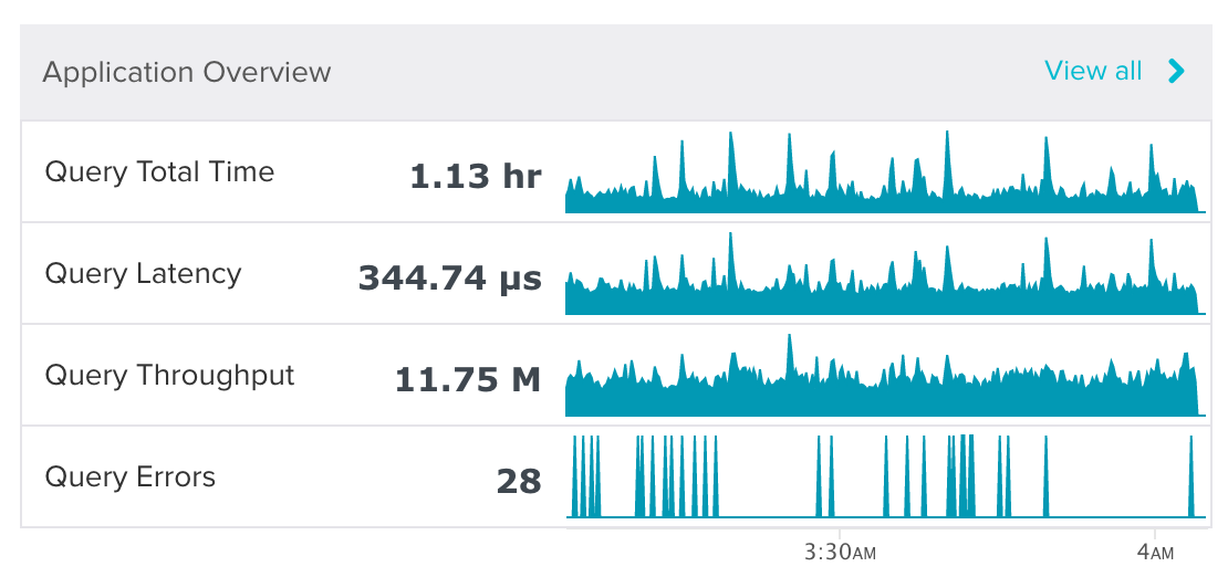
Here’s a screenshot from a monitoring app. I’m looking at the past hour of data. The bold numbers are the aggregate values over the past hour. There were 11.75 million queries executed and 28 executions with errors.
I can hover over the time series to get values for each point.
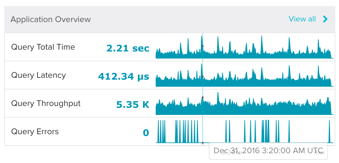
There were 5.35 thousand queries completing at that time.
Notice how each spike in the graph for query errors has the same height. There is one point per pixel, so if you count up the pixels, there are 28 spikes. Because the total during that time was 28 errors, each spike represents one error.
What happens when I hover over a spike? What value do you expect to see on the side?
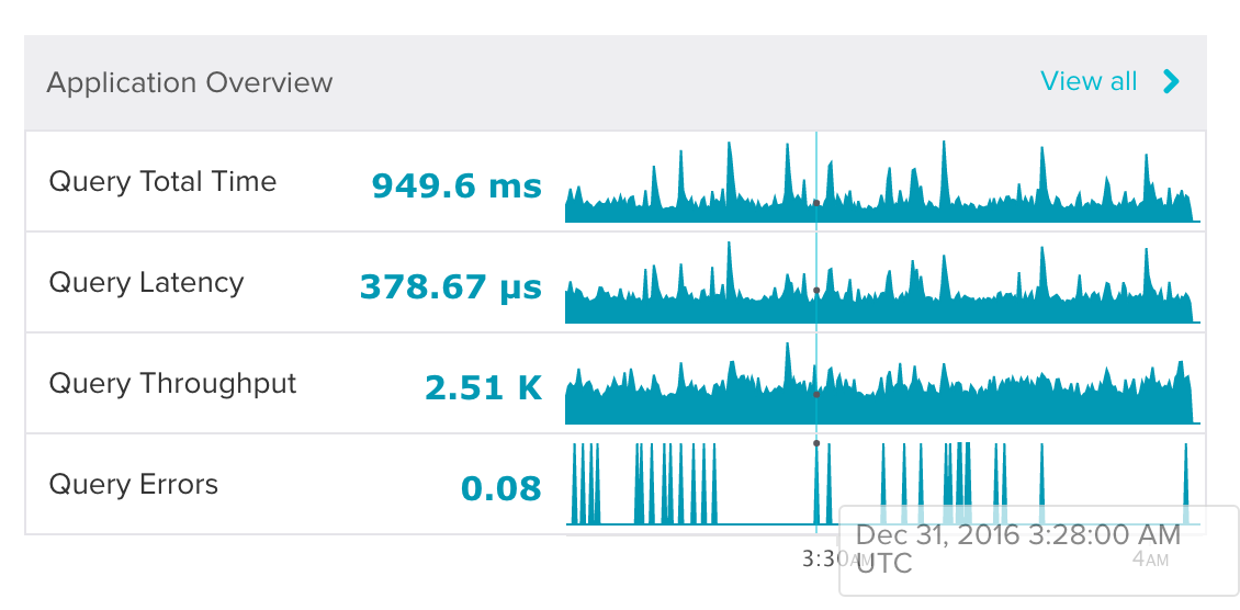
0.08? What? Here’s a hint: because I’m looking at a 1 hour time range and there isn’t enough space for 3600 points, each point represents 12 seconds. 1 / 12 = ~0.08. The weird thing about this graph is that it’s not showing the number of errors (the sum) at each point, but rather the rate of errors (the sum / point size). I think I would only be interested in error rate if the values were really high.
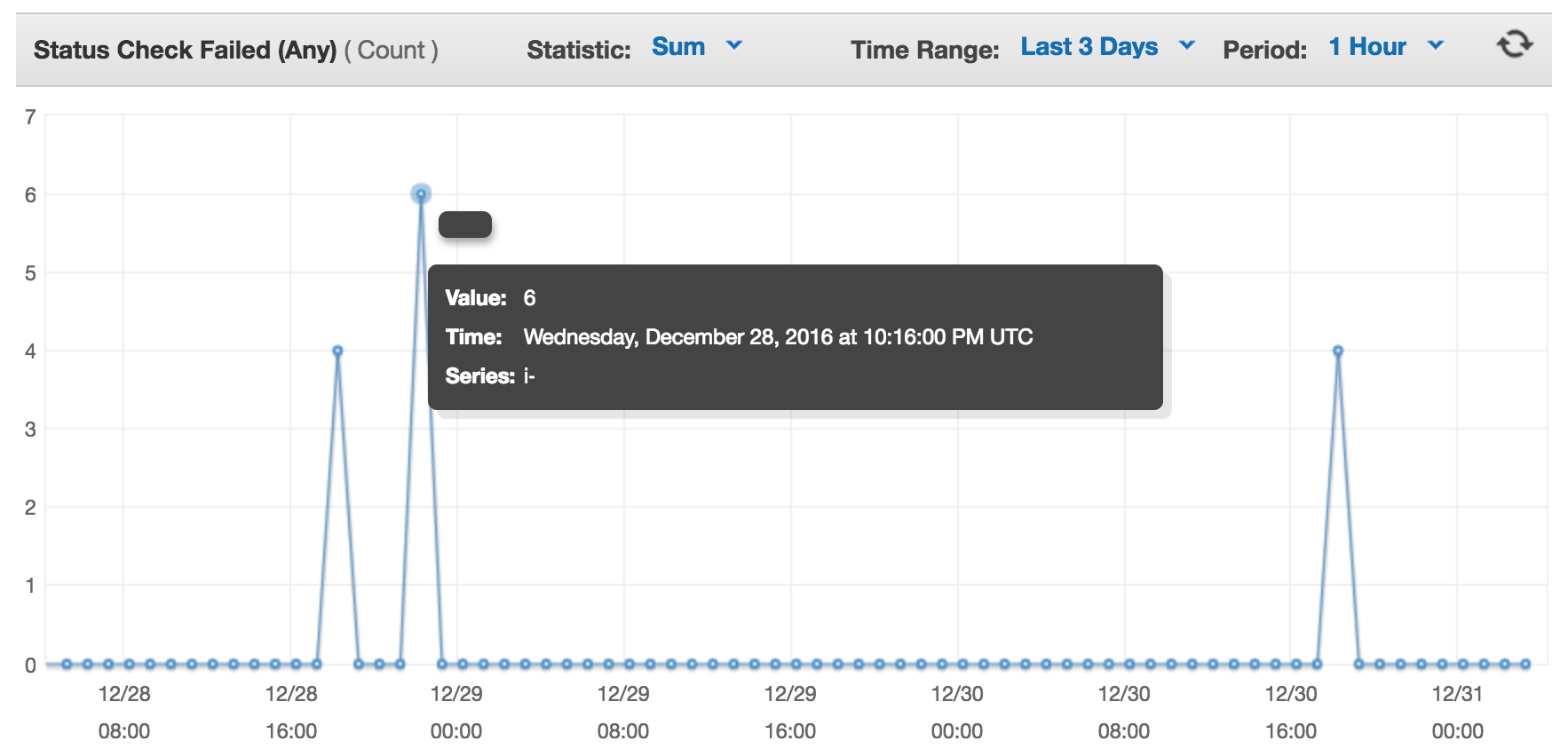
AWS’s CloudWatch graphs allow you to choose what aggregate you want. I think that’s a great approach.
I can use “Average” to get a rate.
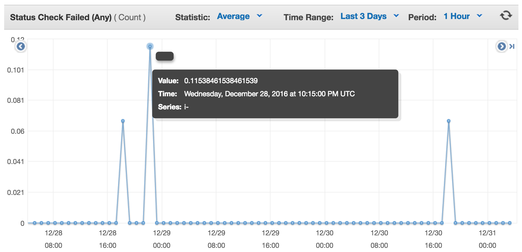
Or I can switch to “Sum” to get the number of occurrences.