Hinting
Can you tell the difference between these two images? Click on them to see a full-size version.
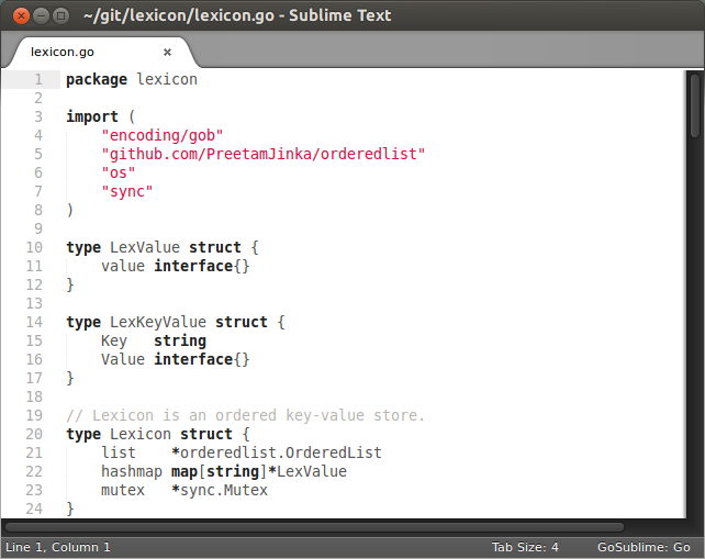

Hint: there is a difference, and it's font hinting!
The first image has hinted text, and it's terrible! It's morphed. The dimensions are funky. Why destroy a perfectly fine typeface (created by artists) by hinting (using algorithms and fancy math)?
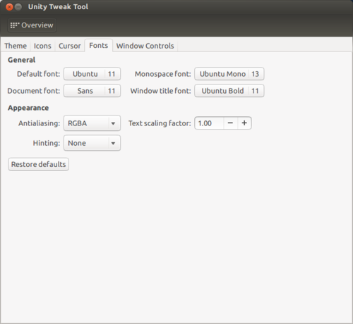
I turn hinting off everywhere. I suggest you do it too. If you use Ubuntu, you can install Unity Tweak Tool:
Sublime Text will still hint. You'll have to use a ~/.fonts.config file to take care of that.
<?xml version="1.0"?>
<!DOCTYPE fontconfig SYSTEM "fonts.dtd">
<fontconfig>
<match target="font">
   <edit name="hinting" mode="assign">
      <bool>true</bool>
   </edit>
</match>

<match target="font">
   <edit name="hintstyle" mode="assign">
         <const>hintnone</const>
    </edit>
</match>

</fontconfig>
Make text look good!