Syntax Highlighting.
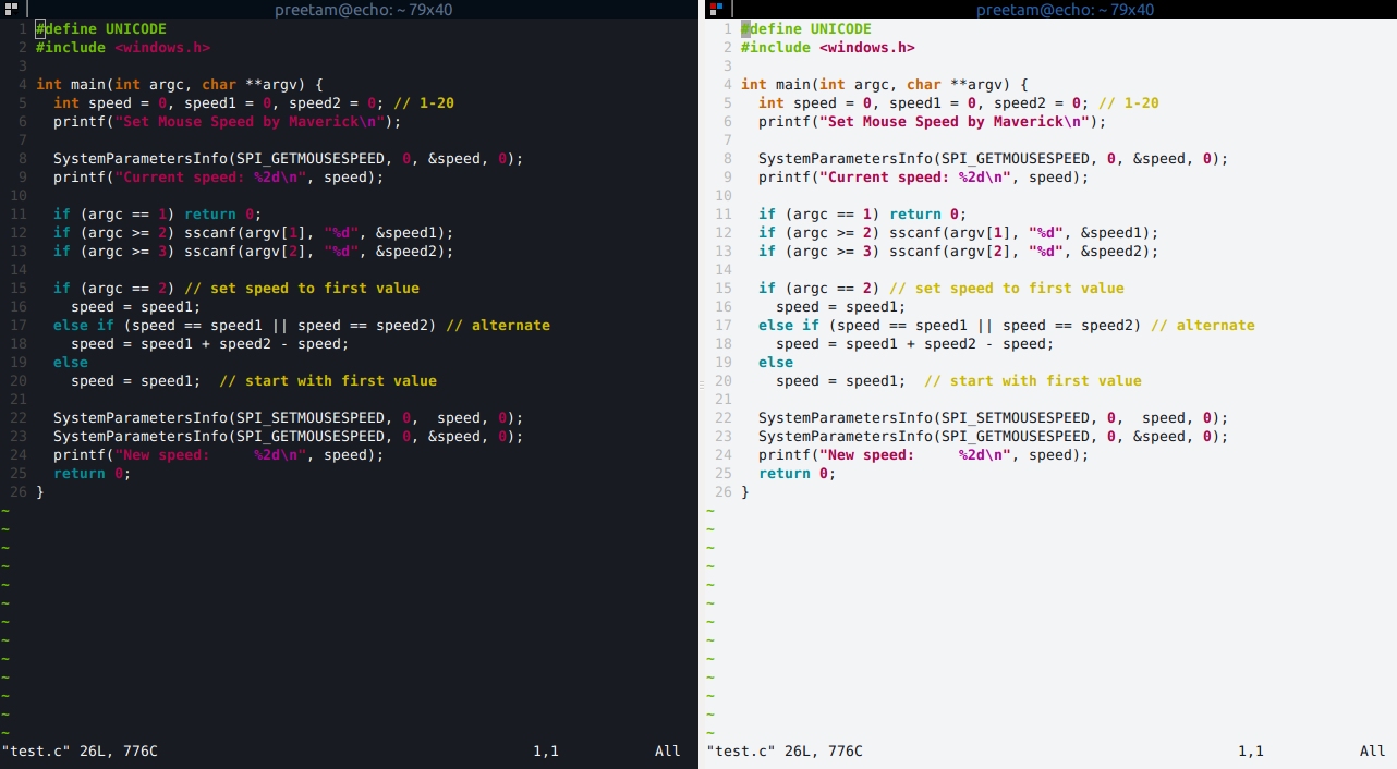
A couple of years ago, for whatever reason, I wrote a color scheme. I called it “DarkFruit” because it has some fruity-looking colors on a dark background. The “LightFruit” version has the same colors on a light background.

I used it for a long time, and I got used to looking at it, but there are many things obviously wrong with it. The colors basically look randomly chosen. Comments are bright yellow and bolded, which was a little annoying. Eventually, I quit using vim and switched to Sublime. I then started to use the GitHub color scheme.
I spend a lot of time reading through the source of Go’s standard packages. In general, it’s well-written and idiomatic. It’s great for getting specific questions about code answered.
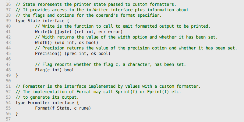
I’m always reading the code directly from the golang.org website. It’s very simple. The only syntax highlighting they do is make the comments green.

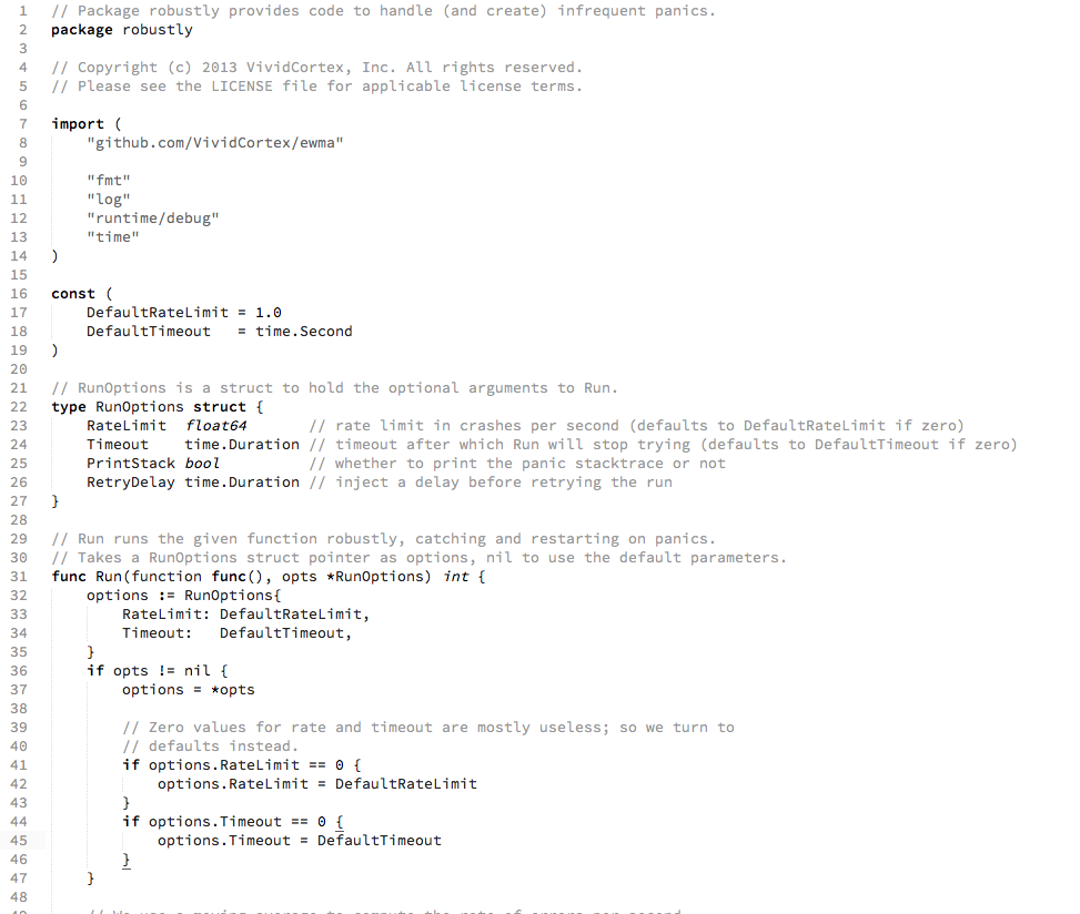
I thought it might be fun to see what it would be like to have a color scheme… without any colors! This is what I came up with:

Strings are a light grey, comments are a lighter grey, normal text is very dark, builtin types are italicized, and keywords are bolded. That’s all there is to it. I think it’s very simple and there are no colors to distract me.
I’ve come to the conclusion that it seems wrong to have to throw color at code to make it readable. However, we still need little helpers like this to let us know if we make a typo. Less is more?
I’ve turned “Infimum” into a Gist: https://gist.github.com/Preetam/14830c9fc72ec052599a
